Harry Turbott was the first New Zealander to gain a degree in landscape architecture, and he came and went between architecture and landscape his entire career. He was known for, among other things, the landscape master plan for the celebrated Freemans Park apartment scheme in Freemans Bay, Tāmaki Makaurau, and for introducing the idea of landscape design into motorways, waterfronts and parks. He’s also known for buildings, including the Arataki Visitor Centre, which opened in 1994.
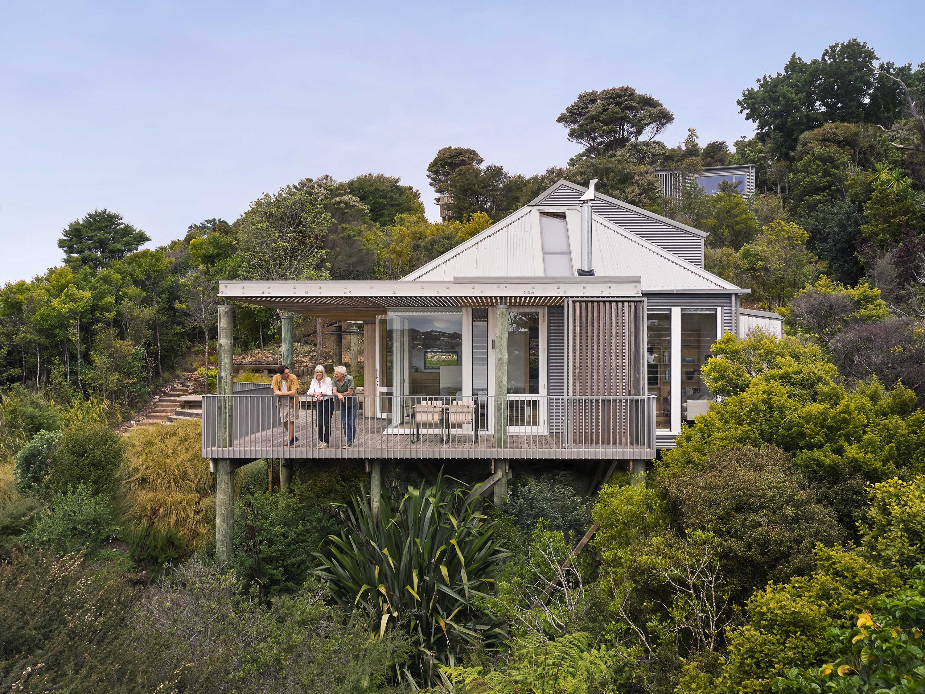
Sometime in the 1980s, Turbott bought a steep site on the edge of the harbour in Auckland’s Waterview. For this, he designed a small, two-storey pavilion with a faintly Japanese feel, built from timber, with a big shingle hat of a roof, a wraparound verandah supported by unusual triangular fins and dormer windows. It was finished in 1992: his studio was upstairs and his daughter lived in a small flat downstairs.
Turbott died in 2016 and the place was sold shortly after to Steph and Josh Helm. You might know of Josh, who co-owns Kingi and Daily Bread, a cult chain of bakeries that started in nearby Point Chevalier. Time had not been kind to the house, or the land. “It was all agapanthus and wild ginger,” says Josh laughing. “It took me two years to dig it all out.”
But the position was fabulous and the house was intriguing. It’s right on the water, where the Whau River meets the Waitematā, part of the city’s largest marine reserve. You can see the motorway, but you can’t hear it. Josh can get in his boat, duck under a motorway bridge and into the harbour, and return – as he did the day before I first visited – with half a dozen decent snapper a couple of hours later. (He regularly catches kahawai and even kingfish.) The sunsets over the Waitākere Ranges in the distance are spectacular.
It wasn’t a conventional house – it wasn’t designed as one. The top floor featured one large space with a huge mezzanine, there was an office-style kitchenette next to the bathroom and no laundry. Downstairs was one big open space with a sunken bath. It was fine for a couple and the only thing the Helms really did was build a deck to connect with a new flat lawn. But by the time they had three kids, the spaces no longer worked and the house needed attention: cladding was starting to fail; there were leaks in the roof.
Eventually they turned to architect Kimberly Read, of llewellyn Architecture, to transform the house into a family home. She was immediately struck by how special the place was. “It definitely wasn’t an ugly duckling,” she says. “It was already quite beautiful – and that’s what drew Steph and Josh to it in the first place.” She was also conscious of the need to do everything inside the existing footprint: new foundations this close to the water would require expensive, potentially project-scuttling geotechnical expertise and tiresome red tape.
That meant carefully pulling the house apart and knitting new spaces into strange corners, while being conscious of materials and the look and feel. Her design touched almost every wall in the house. It was reclad, reroofed and gutted down to the framing by builder James Hosking and his team at J R Hosking and Co, who took care of every aspect of construction. “It’s one of those things – it grows, and as you pull it apart, you find new oddities,” says Read. “For a small project, it was a massive amount of work.”


To get to the house, you wind down a steep flight of stairs cut into the bank, under a gigantic pōhutukawa, and arrive at a simple front door which opens into the kitchen. You’re immediately conscious of the view, which you can see from just about everywhere. It’s like a pavilion, floating in the trees and looking out. That’s helped by Read’s main move, which was to drastically reduce the size of the mezzanine, opening the space up to create a new living area around a wood burner under a sarked wooden ceiling.
Behind the kitchen – where there was previously an entry, kitchenette and bathroom – she pushed out under the eave to create a generous laundry and bathroom. There’s a flight of stairs to a small mezzanine, where the kids watch TV, and a corridor that leads to a long, skinny L-shaped shared bedroom, which can be divided in two with a sliding door. Downstairs, there’s another bedroom, and an open space that will eventually be a second living area, plus an ensuite for the grown-ups. They also plan to build a new main bedroom with a deck on top. For now, it’s kind of a charming arrangement, open to the corridor.
It’s one of those designs that is delightfully pragmatic and quite intriguing: no room is a conventional size or shape, yet they work beautifully. The upstairs bathroom, for instance, is long and skinny, and ends in a deep, half-cylindrical shower with two heads. It’s beautiful, but it also disguises an awkward corner of the house that cuts in randomly to make way for the hill. It works, too. Rather than troop downstairs to the bath, the kids all pile in here and turn both showerheads on.
The verandah received particular attention. “It was kind of a corridor,” says Read, “and it wasn’t really used. So it was about how do we make this feel like it’s a part of the space, an extension of the rooms that it joins onto?” In the living room, there are new wide sliding windows, bifold doors and a generous bench seat. “I wanted it to feel like the room ended at the balustrade.”
While little of the original interior remains, it feels gently era-appropriate. To the language of macrocarpa sarking and floors, Read added green-blue hues through the cabinetry, stone benchtop and tiles. The original cedar doors and shingle roof were shot, but replacing them in timber wasn’t an option. Instead, the roof is corrugated steel in Weathered Copper, that most underused of colours; new doors and windows are anodised aluminium in Light Bronze. Read also matched the green of the original exterior balustrades for a new powder-coated one to the internal mezzanine and designed cabinetry in Melteca with a timber edging detail.
It’s restful, and calming. It’s not a big house, but the living spaces have generous volumes. It must have been a big call to cut back the mezzanine, but it gives a wonderful sense of the shape of the roof, which is such a distinctive part of the design. “I was trying to keep the detailing simple, so we’ve gone with the same details everywhere,” Read says. “The idea was that it would be hard to decipher what was new and what wasn’t.”


1. Entry
2. Outdoor Living
3. Kitchen
4. Dining
5. Living
6. Verandah
7. Laundry
8. Scullery
9. Bathroom
10. Bedroom
11. Playroom
12. Mezzanine
13. Store
14. Hall
15. Deck
Related Stories: